Client: Squarespace / It’s Nice That
Squarespace ‘Sketchbook’ theme design
Illustration toolkit
Try out the theme here:
squarespace.com/templates/sketchbook-fluid-demo
“Bring the Sketchbook trend to your website design by imagining your site as your own sketchbook surface: a place for patterns and textures from real life, bright colors, and intentionally imperfect images and layouts. This design trend, identified by Neasden Control Centre founder and artist, Stephen Smith, is a way to bring a personal, human touch to a digital space.”
More info:
squarespace.com/blog/web-design-trends
itsnicethat.com/features/squarespace-visual-trends-2024-brand-partnership-digital-161224
Client: The Guardian
Art Direction: The Guardian Labs
Illustration and typographic graphic for Paying for the climate crisis: how to stop debt following disasters in low-income countries.
Pre-arranged financing helps nations to prepare and recover faster from hurricanes, heatwaves, cyclones and other catastrophic weather events – but more needs to be done to improve access and affordability
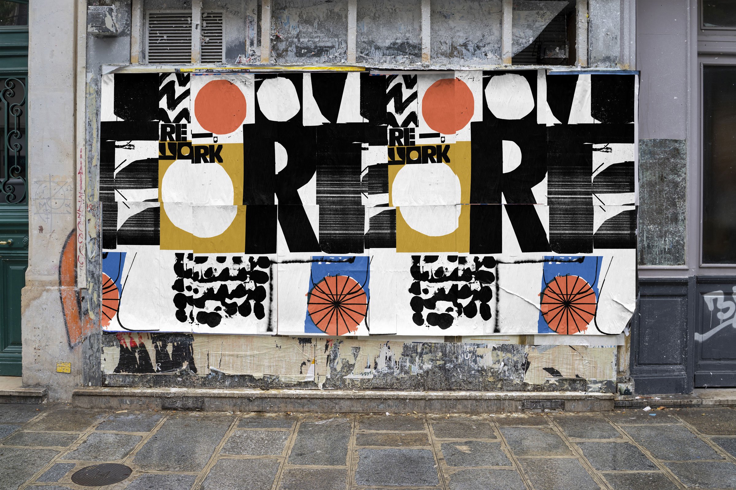
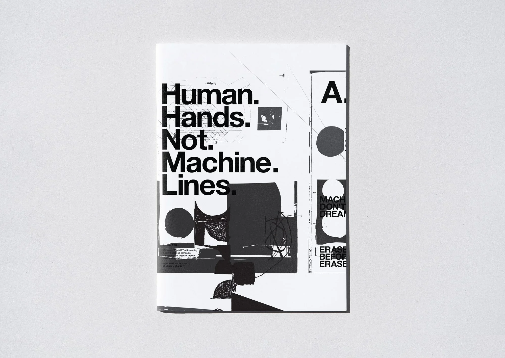
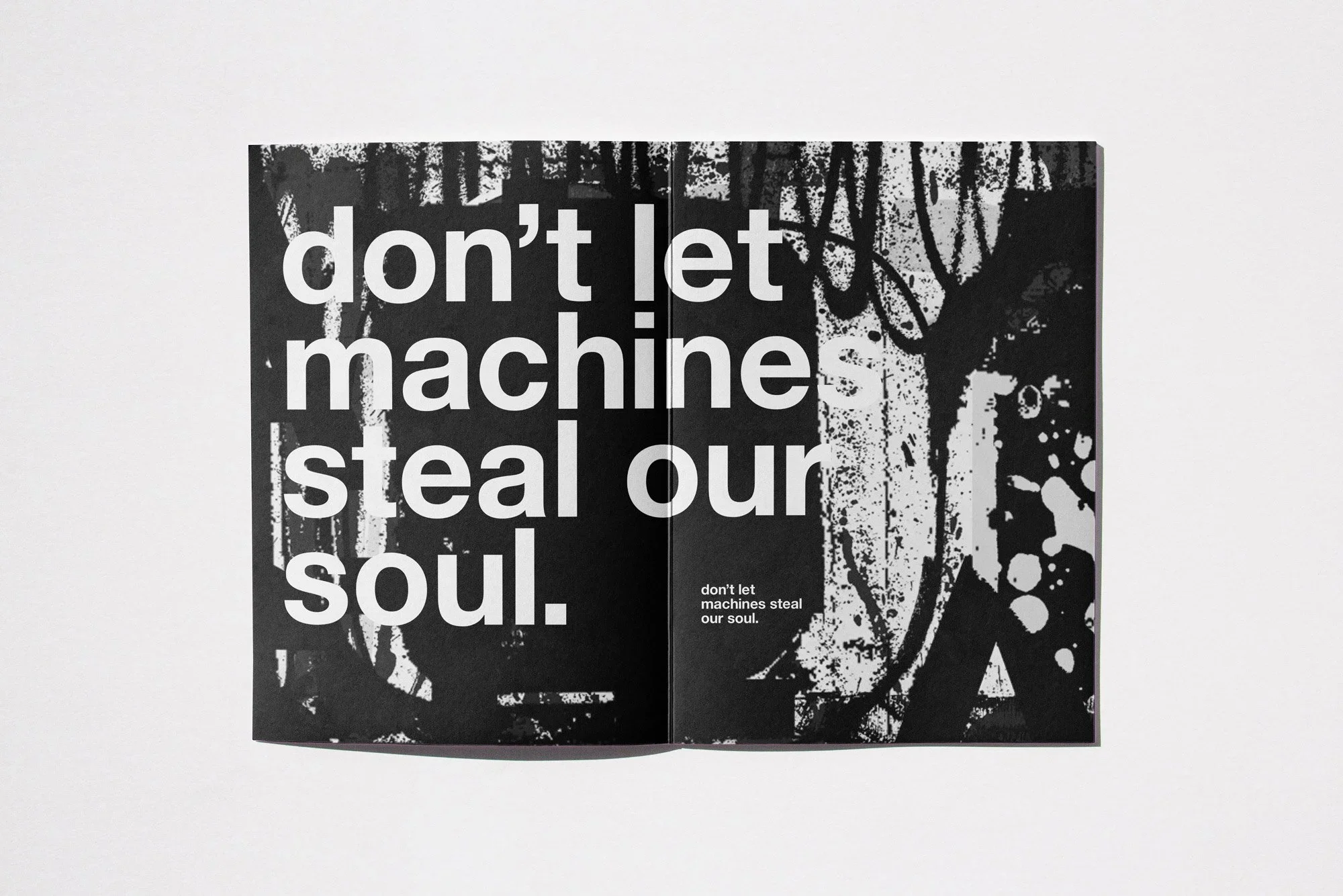
AI Steals Souls
Billboard illustration and design
Collaboration with 51 Studio
Thanks to Boom Creative
Illustration and mural artwork for Warby Parker’s new store in Arlington, VA
Contemporary Collage Magazine
Issue 3 Cover illustration / interview
Illustration and typography in collaboration with 51 Studio for Man Culture’s recent rebrand.
Man Culture; a male allyship network aiming to raise awareness of the impact of violence against women and girls (VAWG) to men and boys.
51studio.co.uk
Client: VSA
Illustrations for VSA Partners Chicago. The illustrations feature images about specialisation, training and event presentations for one of VSA clients. The team also commissioned a series of illustrations exploring the idea of training.
As part of the organisation’s brand development that includes a new strategy, logo and website, New York City Tourism & Conventions bureau commissioned a suite of hand-drawn illustrations and typography celebrating the NYC spirit.
Tapping into travellers’ desire for authentic experiences, the foundation of the Bureau’s new branding comes from genuine perspectives shared by a diverse mix of locals. Working directly with the team, I developed a cast of characters, buildings, shapes, and places that bring authentic NYC voices and experiences to the fore.
Album cover illustration and 6 single covers commissioned by Platoon for Arden Records collaboration with the London Symphony Orchestra
Cafe Abundance illustration and typographic rebrand in collaboration with 51 Studio
Cafe Abundance is a community interest group recuring food from the Rame Pennisula, Cornwall.
Client: Personal
The time is now
Client: Personal
‘Power Up - Power To The People’ in celebration of the life and work of Sister Corita Kent’s 100th birthday.
Client: Hardie Grant Books
Art Direction: Clare Skeats
Illustrations for Catalonia, Recipes from Barcelona and Beyond by José Pizarro. Designed by Clare Skeats.
Located in the northeast of Spain, Catalonia borders France’s Pyrenees mountains and has a heritage and scenery like no other place in the world. In Catalonia, José Pizarro travels from the impressive Gaudi architecture in buzzy Barcelona, to the Roman and Greek ruins in Girona and secluded beaches in Costa Brava to create some of the best-loved dishes from the Catalonian region at home.
Click here to order book
Editorial Illustrations for Harvard Business Review. The illustrations are based on the essential skills of time management skills, tools & innovation required for business.
Client: Millican
Patterns, Illustration, video graphics, custom typeface and logo for Millican’s new Core Collection . Our everyday actions have an impact – the Core Collection is our answer to conscious consumerism. Designed for everyday travel, simple, functional and uncompromising in aesthetics. Made from 100% recycled post-consumer plastic waste.
See the full collection here:
Client: ONE
Agency: Snyder
‘We are One’ - a series of branding iIllustrations commissioned by ONE.
ONE is an international, nonpartisan, non-profit, advocacy and campaigning organization that fights extreme poverty and preventable disease, particularly in Africa, by raising public awareness and pressuring political leaders to support policies and programs that are saving lives and improving futures.
Client: All Good Organics
Cereal box illustration, design and branding elements for https://allgood.organic/ Art Direction by Studio Marek Polewski
Client: Nudge
Collaboration with Will Luz
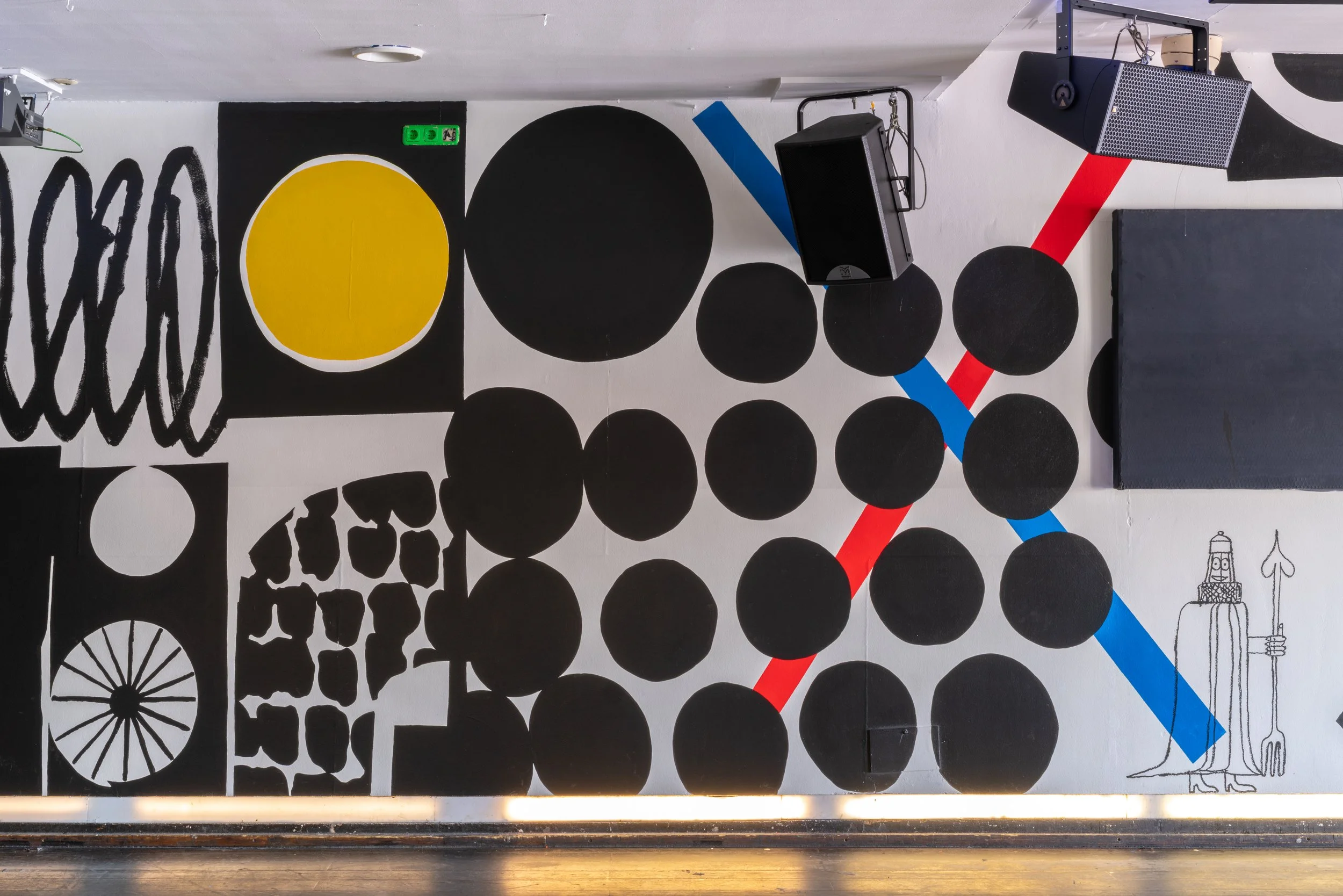
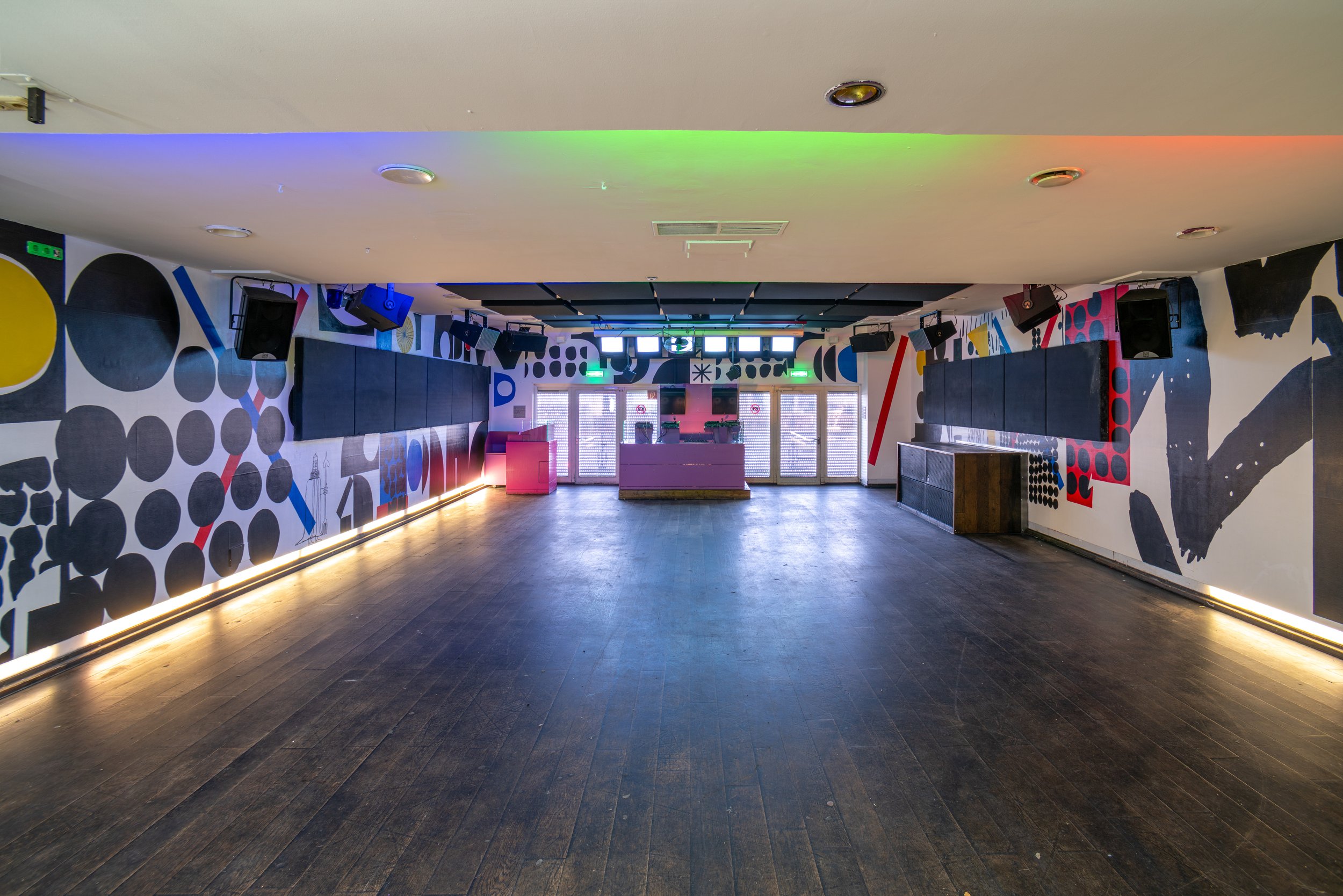
Union Street Corner mural commissioned by Nudge (Community Builders). The mural is a collaboration between Stephen Smith (Neasden Control Centre) and William Luz inspired and based on the community spirit that operates at Union Street Corner.
Photos by Dom Moore
Client: The Edge, Bath
A permanent, building-wide installation responding to the meeting of culture and academia on the University of Bath's campus. The installation is encountered in many different places throughout the building, with each location presenting varying expressions of a common visual language.
The Edge Arts Cafe, Bath University. A collaborative site specific project by Smith and Lewarne.
Client: Minerva, Plymouth
NCC wall art mural installation commissioned by Minerva cafe / streetwear in Plymouth. Minerva is a stockist of the finest premium goods, with a background rooted in street culture, music and free thinking contemporary urban fashion.
minervastreetwear.com
Client: The Guardian / g2
Art Direction: Sarah Habershon
Cover and spot illustrations for The Guardian g2 about how to make everyone day of your life like a holiday.
Kiehl’s Loves is a global campaign celebrating the countries and cities served by Kiehl’s worldwide. Following in its annual tradition of partnering with internationally acclaimed artists, I was delighted to work with the team on the 2024 campaign to create bespoke artwork for 42 countries and cities, for use across print, digital marketing, and limited-edition packaging for Kiehl’s products.Each unique design brought together hand drawn visual icons, typography, colours and landscapes characteristic to each city’s culture and history with symbols of Kiehl’s brand heritage, such as the famous Mr Bones.
It was a pleasure to work with the team at Kiehl’s over the past 6 months on this project and great to now see the work being rolled out worldwide.
Client: Normura Corporation
Agency: The Bees Knees
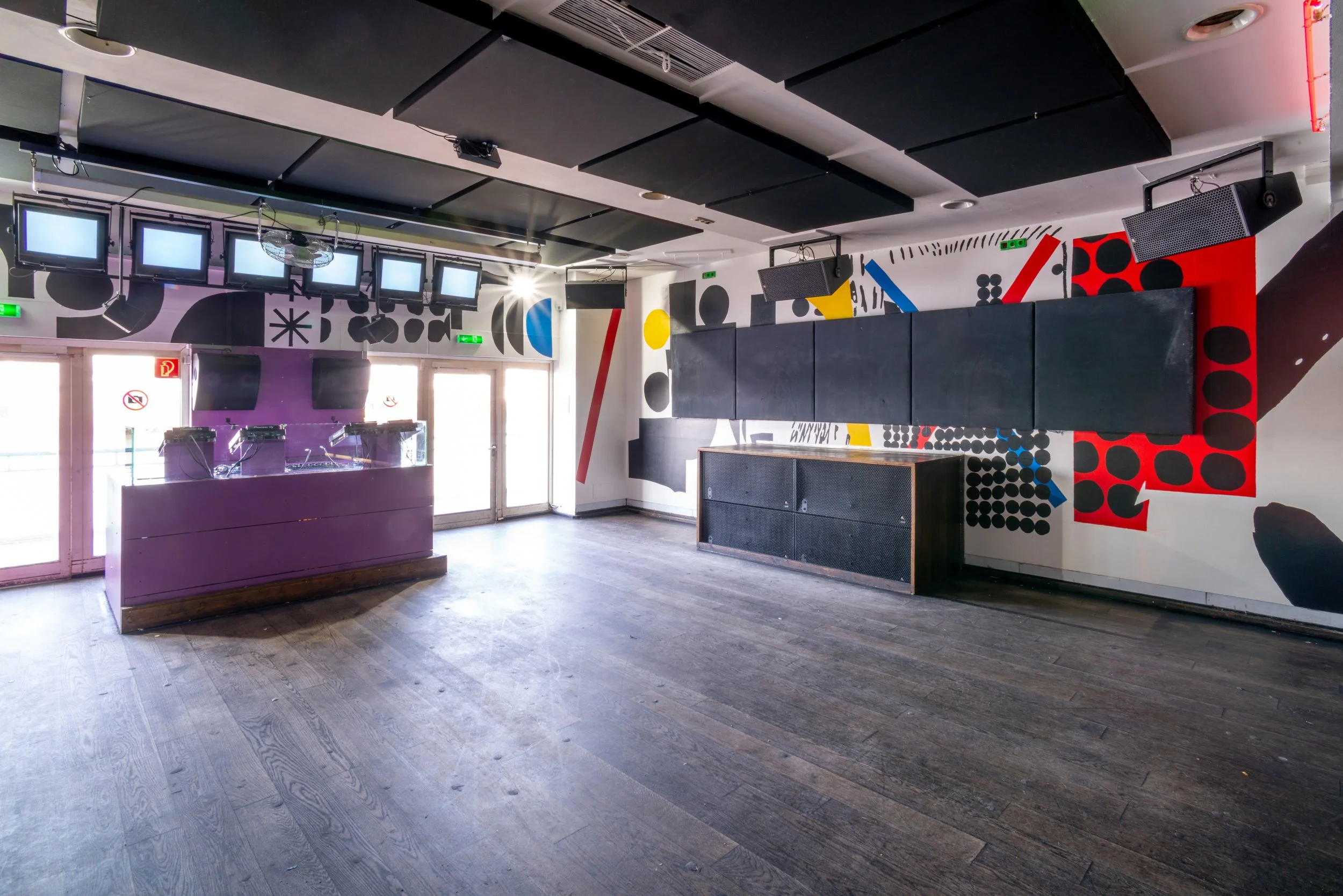
Site specific installation for Nomura Corportation, Tokyo, Japan. The project involved a series of hand painted murals across walls and furniture for Nomura’s head office which is one of Japan’s largest interior architecture firms. The space was designed as multi use ‘breakout space’ where designers and clients can meet, eat and discuss new projects.
Client: Nam June Paik Center
Neasden Control Centre was invited to exhibit a 2 room installation at the group exhibition Now Jump! at the Nam June Paik Center in South Korea. The intention with the work shown was to form a dialogue between 3D installation and the 2D work already created in the Lost Control publication published by Gestalten; extending 2D imagery and building upon it to create an environment for visitors to explore. With the main emphasis on the state of being a member and consequence of freedom. The large-scale owl watchtower enabled the viewer to climb inside the installation and view the rest of the exhibited work from above exploring surveillance of observing and being watched.
Client: Macondo Chocolate Co.
Agency: A- Side
Packaging illustrations for Macondo Chocolate Co.
Art Direction / Design: A-Side Studio
Client: Ultramarine
Ultramarine feat Anna Domino - $10 Rework - design and illustration
Real Soon Records
3-track 12”, Real Soon RS-028
Anna Domino’s stream-of-consciousness lyrics tell the impressionistic tale of post-club after-hours chaos in Times Square, NYC circa 1979. Anna raps off studio equipment brand names like passing neon signs glimpsed in a blur through a taxi cab window. Iain Ballamy wields his saxophone like a graffiti artist with a spray can; scrawling and skronking across the canvas before disappearing into the night. Ric Elsworth lurks in a side alley, unraveling a trash can monologue of wild flamming bongos.
Mixed @pressplaystudio
Mastered by @transitionmastering
Distribution @waswordandsound
Commissioned by global shipping and logistics company Project 44
John Radcliffe Hospital TDA
Client: EBU
Illustrations and animated gifs for EBU which celebrates 70 years in 2020. EBU is the world's foremost alliance of public service media organisations, with Members in 56 countries in Europe and beyond.
“This year, EBU is celebrating 70 years since the founding of the EBU. It’s a moment to pause and reflect on how far we, and public service media, have come in the intervening years and to look ahead.
The EBU played a formative role in bringing public service broadcasters together and encouraging international cooperation so that millions of viewers throughout the continent could benefit from the new broadcast technology.
Now, as we enter the new online era, the EBU’s role is just as crucial as it was 70 years ago. As the world becomes increasingly polarized, people need a media they can trust and rely upon to provide high-quality, independent and trusted news and information.”
Noel Curran, EBU Director General
EBU
Client: Dixie Cups
Agency: Droga5
Commissioned by Droga5 in New York Neasden Control Centre was commissioned to create a series of style frames & illustrations used within an animation celebrating 100 years of Dixie Cups.
Client: Mastercard
Agency: Intercity Studio
Cover illustration developed for The Boston Globe celebrating New England’s rich food heritage, with cultural favourites such as Red Lobster, burgers, hotdogs, and frozen lemonade.
Client: Yale Books
Cover illustration for The life of music by Nicholas Kenyon published by Yale Books yalebooks.co.uk Nicholas Kenyon explores the enduring appeal of the classical canon at a moment when we can access all music — across time and cultures.
Client: The Box
Illustrated family guide’s for The Box Museum, Plymouth.
Designed by Smith and Lewarne
Client: Adobe
Illustration for Adobe Create Magazine about designing for contemporary way-finding systems. “Too often, wayfinding is presented as nothing more than a practical necessity—like an instruction manual that you read because you have no choice. What if, instead, wayfinding were embraced as a design element?”
Client: Millican
Illustrations created the backdrop to this film by Millican to promote the new Core Collection. Our everyday actions have an impact – the Core Collection is our answer to conscious consumerism. When the world moves fast, we strive to be slow. We are responsible for the past, present and future. Everyday Travel. Everyday Action
See the film here:
The Core Collection
See more from this project here:
millican-core/
Shop the Core Collection here:
collections/the-core-collection
Client Hub box
Agency: Meor Design
Typography, murals, illustration and graphics commissioned by Meor Design in St,Ives for Cornish based Hub box
6 Book Set Bookset designed and illustrated by Neasden Control Centre and City Edition Studio for Unknown Fields. Edited by Liam Young and Kate Davies. Published by the Architectural Association, London.
Link to books:
Unknown Fields is a nomadic design studio that ventures outon expeditions into the shadows cast by the contemporary city, to uncover the industrial ecologies and precarious wilderness its technology and culture set in motion. Tales from the Dark Side of the City is a book series that forms an atlas to the territories and stories of a city that stretches across the entire planet, a city that sits between documentary and fiction, a city of dislocated sites, of drone footage and hidden-camera investigations, of interviews and speculative narratives, of toxic objects and distributed matter from distant grounds. They are a collection of tales from the constellation of elsewheres that are conjured into being by the city’s wants and needs, fears and dreams.
The series includes stories developed from expeditions through Bolivia and the Atacama Desert, the Western Australian Outback, the South China Sea and Inner Mongolia, the gemfields of Madagascar, Far North Alaska and the black sites of the United States.
ISBN: 9781907896903
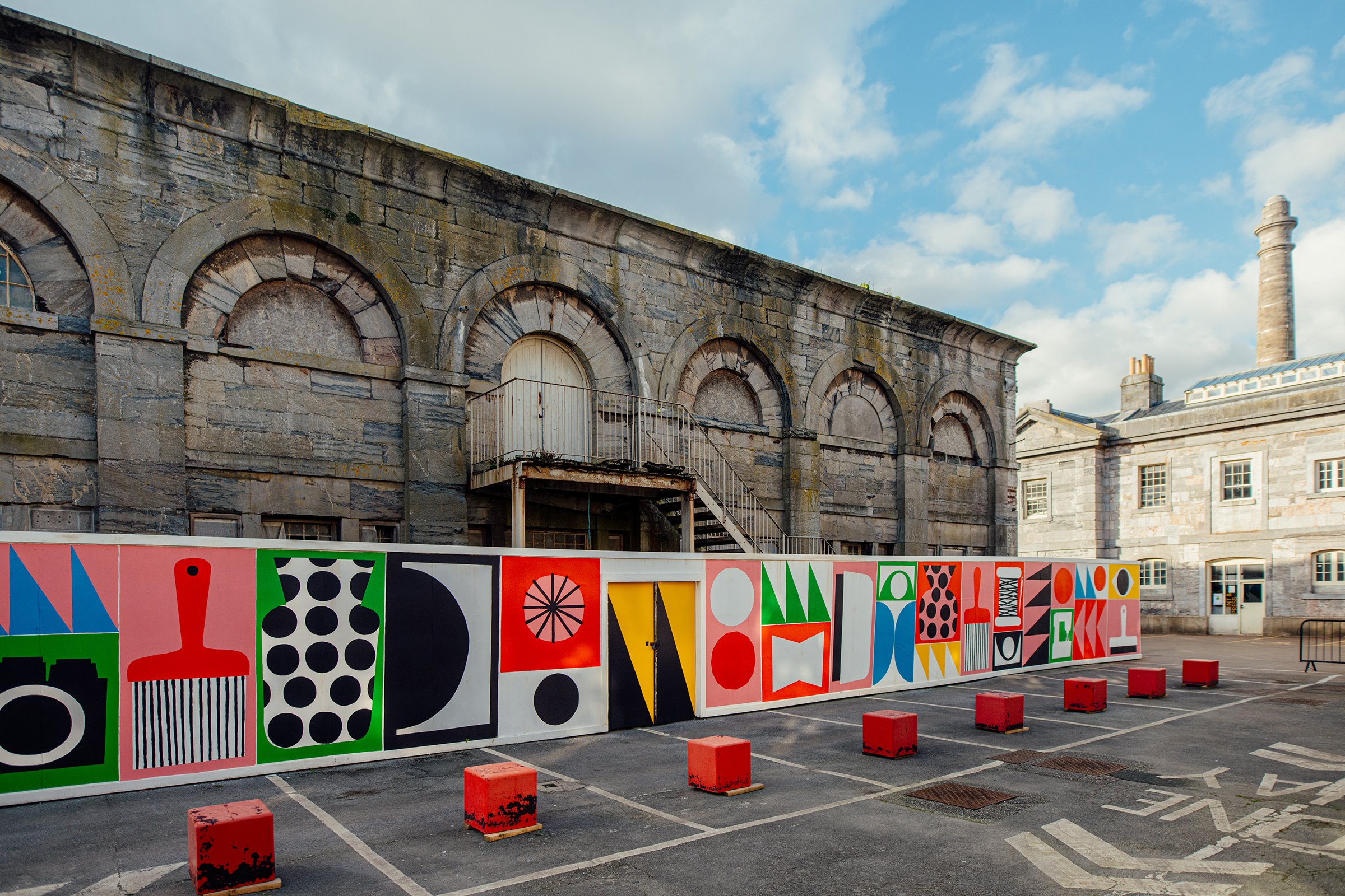
45 Metre hand painted mural for Ocean Studios, Royal William yard, Plymouth
Client: Node Rugs
London Design Museum
Node Rugs is a fair trade company curated by Chris Haughton. Hand dyed and knotted rugs from Nepal in a limited edition. The Neasden Control Centre X Node Rug is available to purchase from The Design Museum, London:
Client: Royal London Hospital London - Barts NHS
Agency: Vital Arts
The installation in the dental ward of the busy Royal London Hospital at Whitechapel features a mixture of large prints together with illustrations around the wards. The aim of the work was to create a playful dialogue between the illustrated figures, animals, birds, forests and urban architecture which would appeal to both very young children together with teenagers in the same space. The artwork is positioned across the ward particularly in locations where the illustrations could be viewed whilst in the dental chair to help to relax the patients. Also this was installed to create a warm and stimulating environment for staff whilst on duty. Special care was taken to blend the colour scheme into the already existing colours of the dental furniture and other equipment in the ward to create a harmonious balance between the work displayed and hospital architecture. Commissioned by Vital Arts / Barts Health NHS Trust. Photographs by Owen Richards.
Client: Crown Estate
Agency: Macgregor Smith
Smith and Lewarne were commissioned by The Crown Estate and Macgregor Smith to work on the UK’s first vertical activity wall. The large scale outdoor installation at Fosse Park in Leicester included a graphic wall, a rubber floor design and a 15 metre window design for the UK’s first vertical children’s activity area. The colourful installation welcomes children and adults to the space by filling the area with positivity in the use of local cultural references and a warm and upbeat colour palette.
Commissioned by the Crown Estate, the brief was to bring some much-needed life and excitement for young people to the otherwise exclusively retail space of the new Fosse Park shopping centre in Leicester.
The designs had to be informed by the local area, in particular the wildlife and cultural history. In addition to our own research series of workshops were organised with two local school and an older peoples' social group. The intention of the workshops were to explore these themes in different ways with people who had grown up in the area.
A Smith and Lewarne project
Client: Artlink
Robin's Ward site specific installation, John Radcliffe Hospital Oxford. The John Radcliffe ward looks after mainly children with neuroscience and specialist surgery paediatric inpatients.
Client: Artfelt
Interior mural illustrations commissioned by Artfelt tchc.org.uk/about-us/artfelt/ for Sheffield Hospital Ward 4.
Client: Facebook
Site specific mural for Facebook London Head Office - London Infra. The mural features a map of London and icons connected with the work that the department works on such as new technologies and infra structure.
Client: Hub box
Agency: Meor Design
Hand painted mural / typography for Hubbox Cheltenham.
Client: Personal
Montreal '67 - illustrated World fair map
Client: Superbly Sunny
Client: PR Week
Uber car share Illustration for PR Week for a story about ride shares and how Uber won.
When bedbugs move into your home: ‘It drives you mad’
They feed all night, then waddle around, filled with blood. Truth is, it is possible to get rid of these pests – but it will cost you hard cash and peace of mind. Cover illustration for The Guardian G2 Section. Link to article:
Client: New York Times
Editorial Illustration for The New York Times Op Ed Column “Britain’s Brexit Leap in the Dark” by Roger Cohen. Link to the article:
Client: Soduk, Japan
Look book illustration elements for clothing brand Soduk SS 2023
Client: Rome Snowboards
Rome Snowboards 2022/23 Anniversary Edition
romesnowboards.com/20th-anniversary-collection-2223
Client: Wall Street Journal
Colour and shapes illustration for a feature in the Wall Street Journal WSJ magazine
Client: Budget Travel
Las Vegas editorial illustration & animated gif for Budget Travel Magazine about the strip and downtown.
Client: Liam Young
Animated title sequence and typography commissioned by speculative architect and director Liam Young - The Great Endeavour
Client: GSIX Tokyo
Bringing together high-end shopping and world-class culture, GINZA SIX is a modern-day reinterpretation of Tokyo’s most historic commercial district, Ginza. Gas As Interface commissioned NCC to design and illustrate positive messages and environments that visitors to GSIX could engage and interact with.
Photos: Kosuke Mae / Gas As Interface
Client: The Guardian
Guardian Labs
The Guardian typographic front cover and illustration for Barclays
Client: The Guardian / ITV
Commissioned by The Guardian in association with ITV to create a series of typographic illustrations about ways of getting people talking about mental health issues.
”We’re increasingly spending less time communicating with family and friends face-to-face, despite its benefits to mental health. With anxiety and depression on the rise, a new campaign aims to get us talking again.”
theguardian.com/britain-get-talking
itv.com/britaingettalking/
Client: Studio Clip
Camping, the great outdoors and wildlife are combined in these exclusive pattern based illustrated products in collaboration with Japan based Studio Clip.
Client: CoCo Chocolatier
Illustrations for Edinburgh based crafted chocolate company Coco Chocolatier.
Client: Time Out
Typographic cover illustration for Time Out London.
Client: Sappi
Agency: VSA Partners
Animated gif and logo typography for online POP campaign by Sappipops with VSA
Client: MT Tape
Site specific tape installation in CoalC Drop Yard, Kings Cross, London for MT Tape at Design Junction with Stone Marketing. Filmed live during the installation by The Progress Film Company.
Client: Wired Magazine
Figure illustrations for Wired Magazine’s design product section.
Client: Artlink
Hospital: NHS John Radcliffe Hospital Oxford
Site Specific installation at John Radcliffe Hospital Oxford. This project involved working closely with both NHS Staff and the commissioning team at Artlink, Oxford Hospital Charity. The site specific artworks were used across the day ward as posters and signage.
Cover and illustrations for g2 in The Guardian for an article about New year, new resolutions... The best way to keep a resolution is form a habit. Art Direction by Sarah Habershon.
Client: The Guardian
Cover typography, spot illustration and animated gif for The Guardian - Mental Health ‘Let’s Talk About It’.
‘Born Bad’ Published by Cicada Books
Available online:
“Wolf wasn’t happy being Wolf. When he looked in the mirror he looked BAD. And when he looked bad, he felt bad, and when he felt bad, he acted bad.”
Wolf wants to change but he’s not sure how. He goes on a journey, meeting members of the animal kingdom that experience change; a caterpillar, chameleon, salamander and seal, to name a few. With their help he undergoes a magnificent transition...
A project with Journal Standard Furniture and Journal Standard Square in Japan to develop a series of illustrated repeat patterns & type treatments for prints / homeware / greeting cards & other products released over the festive holiday period.
Client: Element Skateboards
Element Skateboards Madars Apse Deck Illustration including working progress board designs for Evan Smith.
Client: Adobe
What Art Directors want: Tips for Editorial Illustrators
Adobe Create Magazine link to article
“Across the spectrum of print and online publications, art directors rely on illustrators not only to create beautiful and attention-getting images, but also to help impart information and express complex ideas. Editorial illustrations bring stories to life and entice readers to engage with content. It’s bread-and-butter work for many illustrators, and many find it extremely satisfying. The first step? Getting the attention of an art director.”
Client: Bilanz
Start Me Up! Hand Drawn Type for Bilanz.
The lettering was used in print / online and commissioned specifically for the ‘Start Me Up!’ contest which is Germany’s largest annual start up company competition sponsored by Daimler, Deutsche Bank etc The client wanted a strong identity for the type which acted as a logo for the competition. Particular care was used to make sure the graphic could be read easily at different sizes.
Client: Washington Magazine
Food illustrations for Washingtonian magazine for a feature of the best upcoming restaurants issue.
Editorial illustration The Guardian Review Literary Quiz cover
Review cover illustration and spot object illustrations for The Guardian Review Literary quiz of the year. Art Directed by Sarah Habershon. Click here to view the illustration and quiz: theguardian.com/books/2015/dec/19/literary-quiz-of-the-year-as-set-by-authors-part-one The illustration features over size A B C lettering characters which form the multiple choice answers and incorporate illustrated hand drawn line characters and objects.
Client: Cubby’s
Agency: 7D8
Cubby’s Illustrated Packaging - Illustrated packaging developed for US based restaurant Cubby’s commissioned by 7D8
Artisan Kitchen & Bar, Manchester - Illustration for Living Ventures restaurant used across printed menus / online.
Illustrations & typography for board designs / T-shirts for Evan Smith. Grayson Fletcher and Madars Apse - Element Skateboards
Commissioned by The British Library to produce a vertical scroll illustration for a series of literature quizzes for use online. The illustration was designed to also be used across 4 separate illustrations as well as the main scroll.
Client: Modsy
Agency: Blik
Blik x Modsy Collab Installation for San Francisco based Modsy’s Head Office (Designed to custom fit Modsy’s office walls.)
whatisblik.com/blogs/projects/modsy
Cover Design: Neasden Control Centre
The No.1 Ladies Detective Agency
Little Brown Publishing
Client: Blue Q
Socks, oven mitt and tea towel illustrations for Blue Q
Oven Mitt click here
Socks click here
Hand drawn type for Monotype's Recorder Magazine
‘Letter forms of the future’ hand drawn and collaged letterpress type for the Recorder Magazine commissioned by Monotype. Art Direction: Luke Tonge
Client: Living Ventures, Artisan
Menu Design & Illustration, Artisan Kitchen and Bar, Manchester
Client: Living Ventures, Artisan
Artisan Kitchen & Bar is situated in Spinningfields, Manchester. Artisan commissioned Stephen Smith to design the identity & to produce site specific artwork, illustration and murals for a large installation as part of Living Ventures restaurant in the city. Set in a vast 12,000 square foot, semi-industrial space and working directly with the interior designer Neasden Control Centre was commissioned to paint large scale artwork directly onto the walls of the entrance foyer, stairwell and pizza oven as well as design graphics applied to wall surfaces around the site. Alongside the interior artwork, Neasden Control Centre continues to work as a freelance Art Director for Artisan Kitchen & Bar.